Making Shout, a GIF creation app
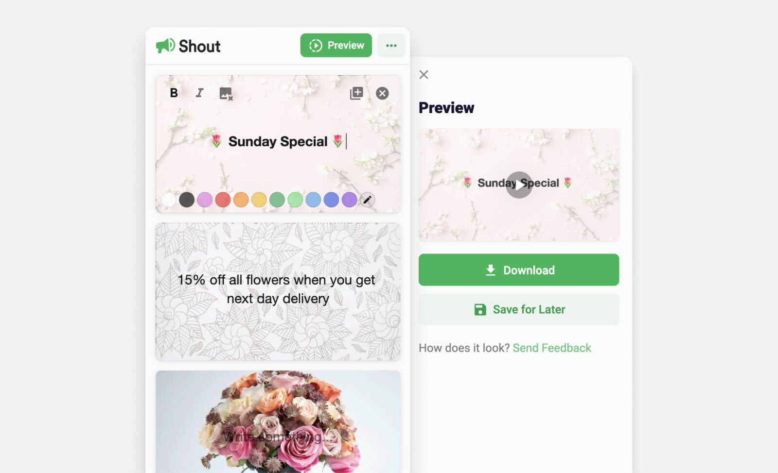
Thinking back over the recent work I have done, I don't think I gave enough time to document my experience with a little side project from the start of the year: "Shout" is a web app which creates colourful animated GIFs from text and images.
The idea for Shout partially came from an obvious trend on social media towards using animated text for marketing. I would often see posts like this for events or products:
This seemed like a simple output. I had no idea how to achieve it, or even if it was possible with an in-browser solution, but it was worth a try. I wanted to start building something extremely simple. I started with a single static frame using HTML Canvas (my first time using it). I put a rectangle in it. I set the colour of that rectangle. Very interesting... After some work, I had my code adding a coloured canvas with some text in it to the page.
From this single frame I started to build programmatic text setting. I added an input next to a canvas and drew that text input on the canvas when a button was clicked. The next step seemed to be creating a GIF from multiple canvases. I had two static frames which I could export as data URIs and then use the GIFEncoderJS library to create a GIF from them. I set the final GIF data URI to be the source of an image on the page. Everything was working nicely and I had a rendered GIF.
Prioritising a simple, releasable version, I worked on the styling and started to format the input so that it would look exactly like the canvas it would create. After lots of fiddling with line-heights, scaling and positioning in the canvas code, I had a page which would create two animated text frames from the input.
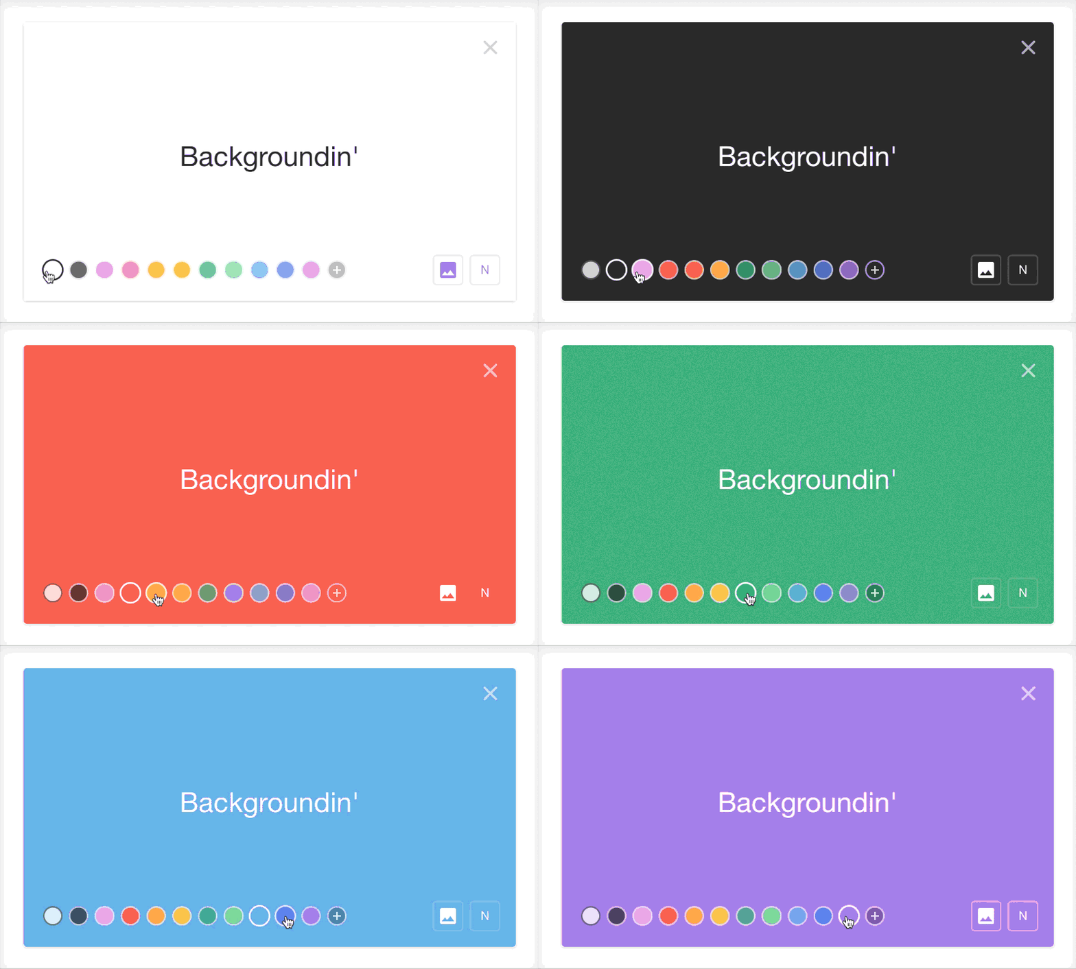
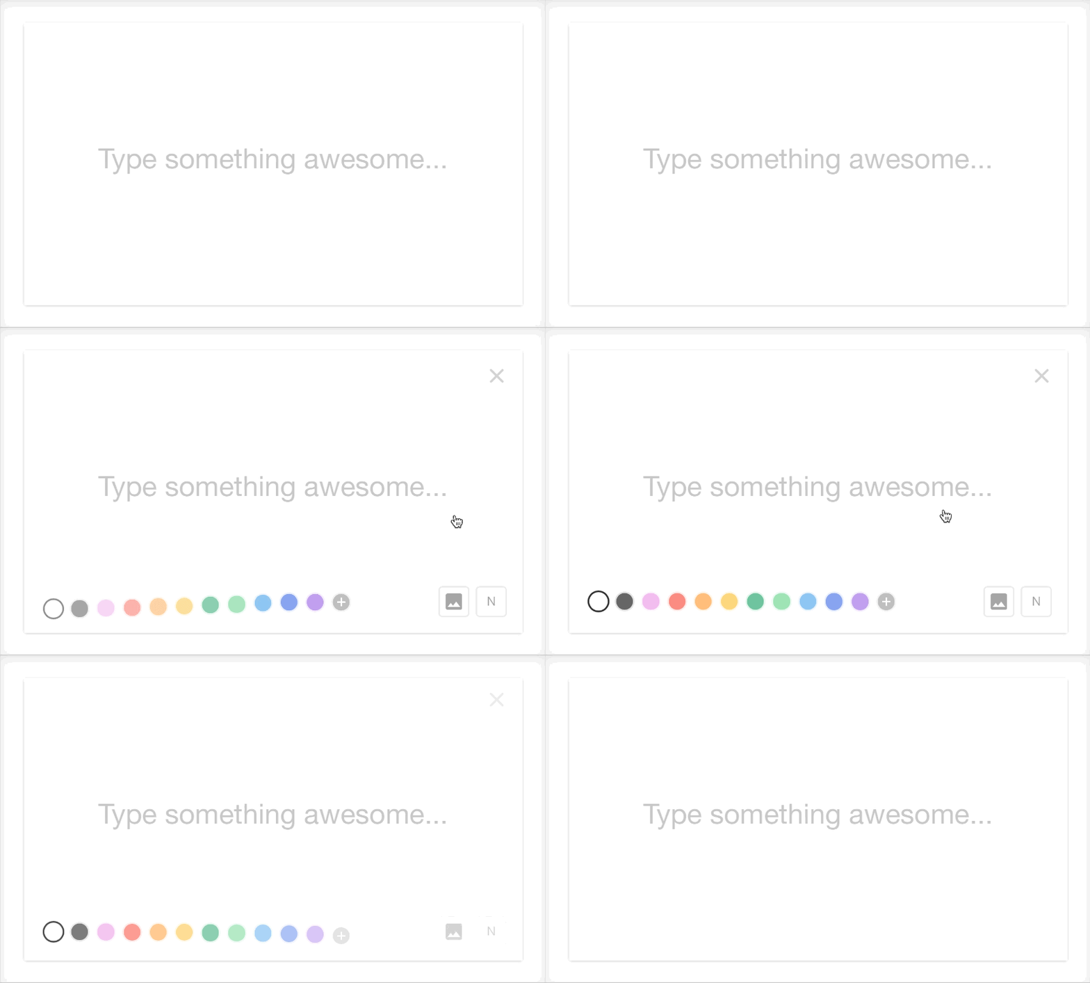
After some more styling, I added some preset background colour options. These named colours were shown on each frame and were got on GIF creation to set the background of each frame independently.
Next I needed some refactoring to create the final GIF more generically from reading the HTML elements on the page. My code would now loop through each frame and collect the text and styling data, then create a frame and append it to the GIF sequence. Now that I had separated the GIF creation from any hard-coded elements on the page, I could add features like removing frames. A step up from that was re-ordering frames which called for another library. Sortable.js to the rescue: after a couple of lines of JS and CSS I had re-ordering working by dragging frames up and down. After a few more lines to manage frame indices, GIF creation with reordering and removing frames seemed to be working.
At this point it seemed like I had the basic features sorted. I played with the tool and tried unexpected inputs. New-lines were not being so friendly to me, and the frame timings seemed a little odd. To tackle the first I added some restrictions to the text inputs with JS, managing new-lines specially. For the timing issue, I created a function to calculate reading time of a frame and switched timings to use that – tweaking this till it felt right took some time.
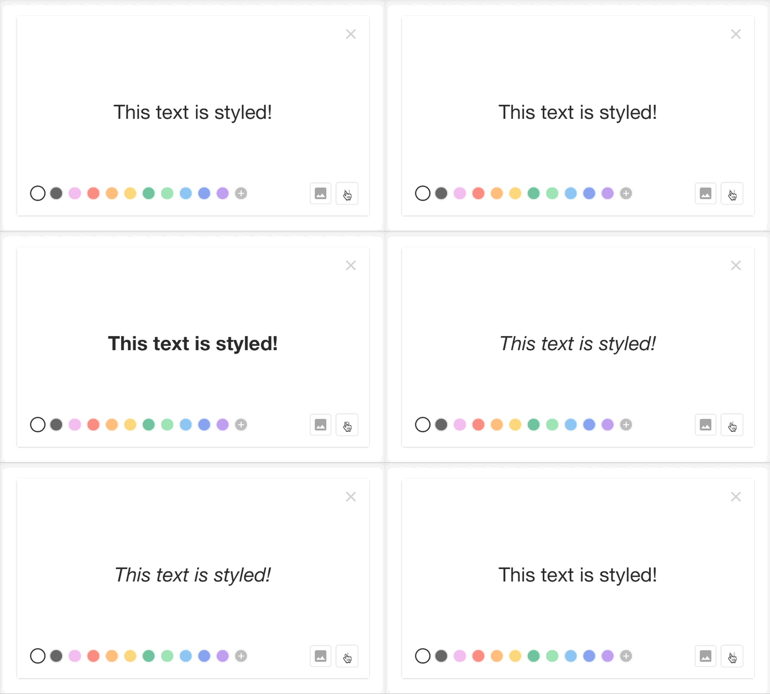
Now for some more styling: I added a toggle for text style. The options for Bold, Italic and Normal seemed sensible. Each of these was now also checked when getting frame data and rendered in the final frames.
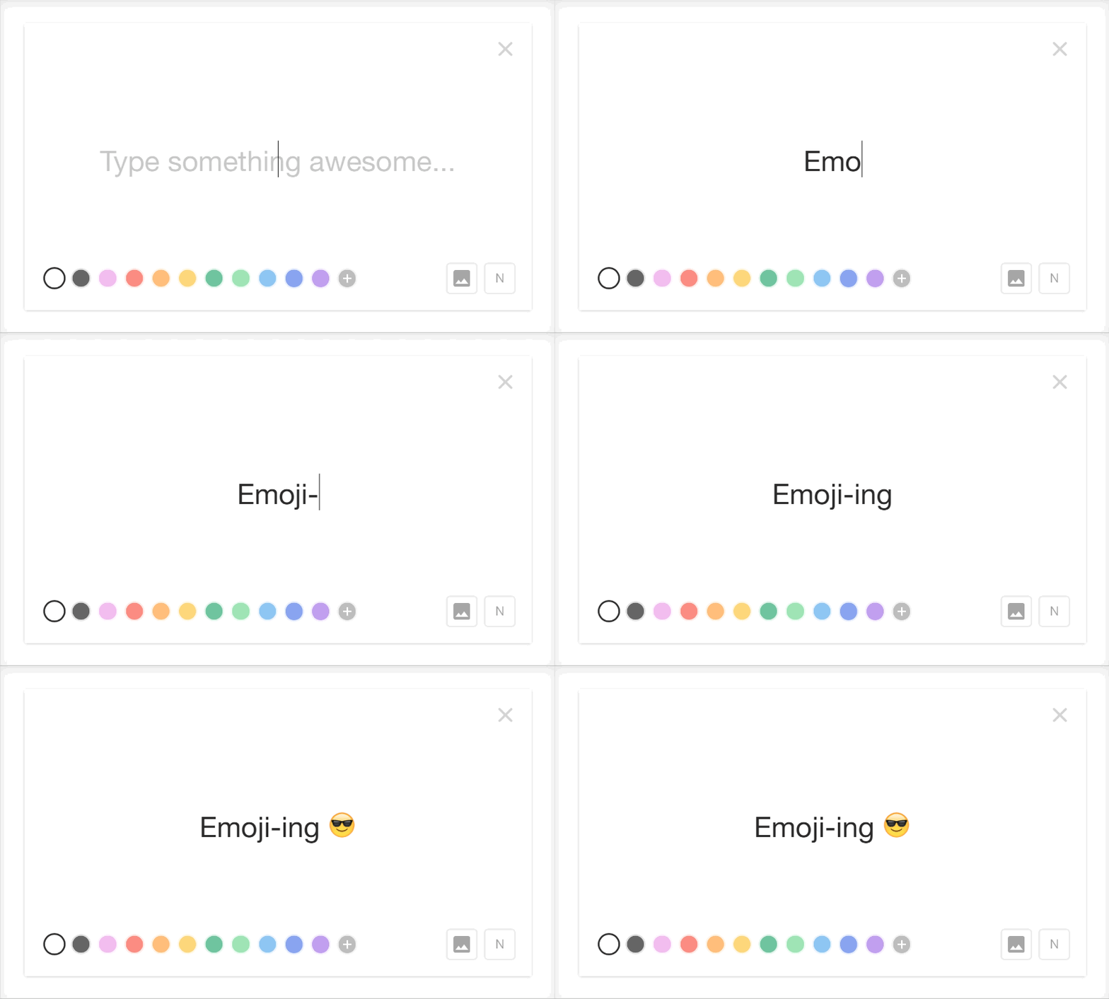
Next up, being adventurous, I tried typing some emoji in my inputs. I was surprised to find that not only did they work with the fonts I had chosen, but they were also rendered correctly by the HTML Canvas and in the final GIFs. There was one issue with how Chrome and Safari render emoji which meant that they would be distorted or disappear in the Italic or Bold text styles. I considered this to be a minor issue and not one I could fix.
At this point, I turned to some final styling and animations, making the frame editor sleeker. I really enjoy being able to focus fully on design implementation, finding even small interaction issues and fixing them. That was me happy. I was ready to release the project quietly to a few friends and see what they thought.
After some time playing with it on my own and getting feedback, there were a couple of important fixes and additions that seemed needed: a fix for playing speed, custom frame colours and background images. The timing issue was caused by the way I was adding frames and how specific apps render them. Because some apps overwrite the frame-duration in a GIF to a standard duration, my 2 second-long frames were showing for 100ms in some apps (notably Telegram). With some tweaking, I added a loop to create individual 100ms frames to fill the total of their expected duration. This fixed the playback speed issue!
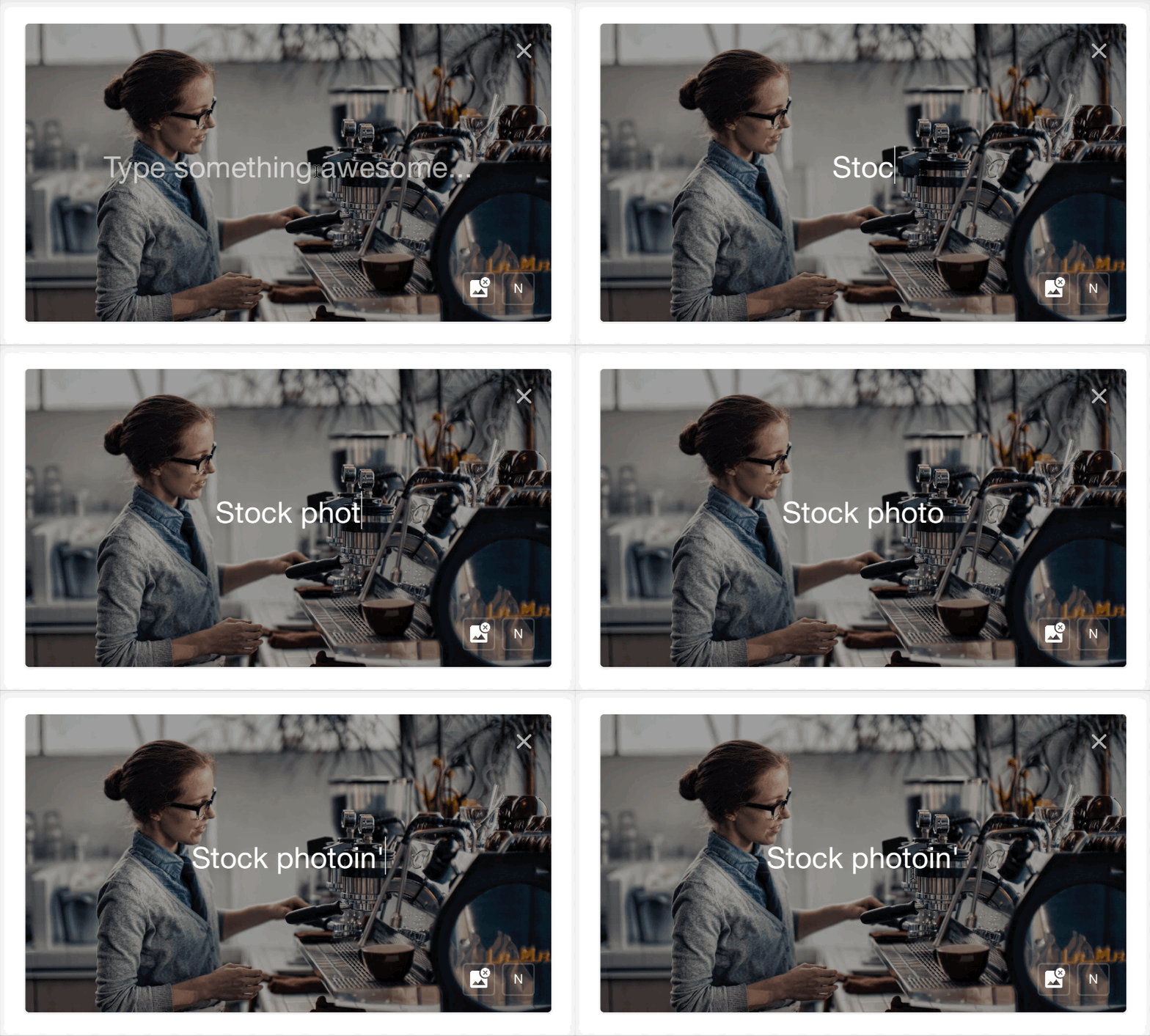
As for the new features: I added those in without too much trouble thanks to spectrum.js for colour-picking and some simple JS for handling file uploads, converting them to blobs and drawing those on the HTML canvas. Image positioning and shading was a little tricky as it involved loading the images to calculate their dimensions and placing them in the centre of the canvas accordingly. I also wanted to add a case so that it was possible to add an image-only frame and not have it shaded. With these working, I moved on.
I was starting to see another issue: processing performance. Especially with images, it was taking 12+ seconds to process and display the final animated GIF. I didn't really know what was going on behind the scenes in my GIF encoder, so I had a look. First of all, I tried to stop the page from freezing during encoding by using a Web Worker to run the encoding in a separate process. After that, the page was smooth during encoding, but it was still uncomfortably slow.
Looking to improve the speed of encoding, I checked how GIFEncoderJS was working. For each frame I added, the encoder would create a frame and append it to the GIF sequence. This is perfect for most cases (e.g. a video converted to a GIF), but in my case where there were many exact duplicate frames, it was not efficient. I added an extra flag in my encoding to reuse previously calculated frames. This simple change sped up processing massively – by about 10x. Going this deep into the library wasn't something I had intended, but being able to interpret the code and finding this solution was great.
With the encoding speed improved, I thought of one last thing. Loading images through data URIs was another bottleneck. It wasn't reliable across browsers and the long URLs were causing crashes in Safari due to its URL history storage and URL suggestion. I looked over my code and found that blobs may be the perfect tool to use. I packaged my data URI in a blob and linked to it through the GIF preview image tag on the page. It worked much more smoothly and gave a simple address for the final GIF. Perfect.
Actually, it will never really be perfect. There is more I have considered doing and more I may add in the future: storing images on Firebase and creating public URLs for them, positioning images on the canvas, GIF background support, more fonts and sizes. The list goes on. However, I am happy. I really liked the idea of limiting the user through a format to inspire some creativity and freshness, and I think Shout's limitations encourage that mindset.
I think working on Shout summarises what I love about side-projects and building things: it's the joy of the chase, of finding that elegant solution to a problem you see, of making the interactions as fluid as possible, of taking the time to consider and perfect things you care about in the product. It's the fun of learning while you work on something you really enjoy.
“Shout” came from the idea that colour and animation can give more volume to your words. You should try it out.
Have a lovely day.
© 2026, Graham Macphee.
